
So at Papertrey Ink's Day 4 celebration contest, we are to create a project inspired by one of the team's favorite color combos from a free download of combinations.
http://nicholeheady.typepad.com/capture_the_moment/2012/01/5th-anniversary-day-4-cafe-press-new-pattern-packs-color.html
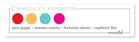
I went with Danielle Flanders. Besides really loving the combo it matched up with Melissa Bickford's LOVE image free download from yesterday~ YAY! All I had to add was the Pure Poppy red which I added in back of the L-O-V-E using my 'Stamp' die from Cuttlebug. Now let me tell ya, those letters looked straight when I popped them on their backgrounds with Pop Dots, but in the photo~not so much :o)
The blingy exclamation point is from Sudio G, Corner Rounder from EK Success and White base cards stock is PTI.
I hope to get a couple more cards done for this fun challenge -?- we'll see
Love how those poppy backgrounds make the letters pop off the page! Gorgeous!
ReplyDeleteAnd that happens to me all the time. It all looks straight and perfect until I take a picture. Than I post it and find all the mistakes! :)